New Draft for Fire In Ice
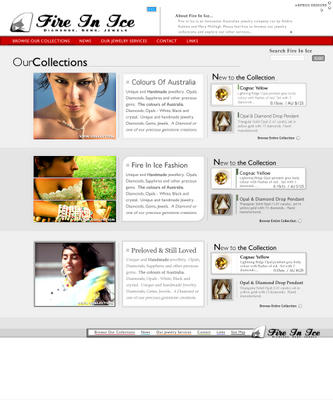
Sometime in the last two weeks, the owner of FireInIce.com.au requested a re-design of the entire Fire In Ice site. I have spent the last week or so, slaving away at proportions and schemas for the new design. I thought that I would give a little sneak peak at the new design here, with a small run-through of the GUI. *grins* Here's a preview of the main page design *click for a full size view - though the full size file is 420kb, it may take a while to load*
 Descriptions;
Descriptions;- I have re-designed the links bar and broadened what the links contain (ie. "browse our
collections" contains all collections for the site, "our jewelry services" includes 'brokerage and appraisal', 'education, training...' etc). On rollover of any of these links the bg will change colour :P - Putting a description of Fire In Ice up the top ensures that the viewers know what kind of site they are viewing. When a viewer pulls the cursor over this, the description will expand. (very sexily, with an alpha shadow around the edges and a nice scroll bar on the side :P)
- I'm not sure about the new logo's font (it sort of reminds me of Coca-Cola, i'm not sure if i'll be sued yet, lets hope not), but it is eye catching. I had to design a new logo because the old one wasn't as eye catching.
- Each collection has a different style in an attempt to embody the type of collection. If you look closely you can notice this in the different fonts, the different presentations of the images and thumbnails.
- The small thumbnails will only exist on the front page just because there isn't enough space to have larger thumbnails on the front page. When browsing the collections I intend to use thumbnails at least twice as big as these. The first piece in the new collections represent a rolled-over piece, the second represents how the piece will be displayed normally
- The large collection images are taken from some stock photography sites and arent intended to be published as is, they are only there in the draft to represent the type of image that would suit the category. I was thinking for the 'Colours of Australia' collection the imagewould be a quite romantic and rich image, for the 'Fire In Ice
Fashion' image one that has multiple pieces of jewelry and an accentuated style, and for the 'Preloved & Still Loved' image one that contains some hint of a story, or history. You will need to photograph similar images before the site is published, the sooner the better.
posted by Niall Campbell at
4:03 AM
![]()
![]()


0 Comments:
Post a Comment
<< Home