K Frog Designs

Tuesday, August 16, 2005

Fire In Ice Piece Display

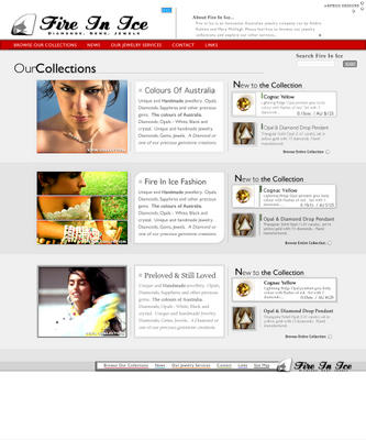
The image display took a lot longer than expected to design, so now I 'm a little behind in the drafting process, but at least I'm happy with this design. There's a lot of new little styles to this draft, including the new search box, and the buy/enquire/print icons (which I love).

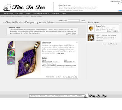
I think I'm going to revise the other drafts to suit this later, because the hierarchy of information display is very important in site design, and currently there's little connection between the designs :( *click for a full size view - the full size file is 280kb, it may take a while to load*

Descriptions;
  • The search site box has been minimalised and brought in line with the main content of the site, just to ensure that there's a connection between the main information being displayed, and the potential content on the rest of the site. The plus sign (now that I think of it) is a good symbol to use with search boxes, it alludes to the vast potential for other content.
  • I've re-aligned the RSS button, as I've been getting so many suggestions to do so (though i'm not sure why). It is now a less important element of the site, and it doesn't conflict with the main logo.
  • Now I'm not sure about the new contextual location display, as it does conflict with the header elements, but it is essential to the site. Its a contextual header display because you could be viewing this piece from the browser, or from the collection display, or from the price list, or from the blog, so the location display will change to respond to this (possibly through session data or through a HTTP variable legend – though the latter option would confuse google and other search engines, and double up on the same content, which could eventually remove the site from the search engines, so thats a very bad idea)
  • The "similar pieces" display on the right hand side needs a little more work I agree. It still doesn't fit in with the rest of the content. The similar pieces display is meant to be contextual too, here's a run down on what would be displayed;
    1. From the collections -> Similar Pieces
    2. From the browser -> Previous and next results obtained from the browser
    3. From the price list -> 20 previous and next items from the price list (displayed in textual form)
    4. From the blog -> other pieces talked about in the blog, previous/related posts and comments, blog archive, other usual blog elements (like the ones on the RHS of this blog)

  • The "featured piece" box will display for pieces that have special offers, or other information attached, like blogs/etc. I think there needs to be a revision on the "take offer" button, because viewers could be confused between the "buy" button and the "take offer" button.
  • The zooms on the left hand side of the main image are further images of the same item so the user can have a better understanding of what they're looking at. These elements have rollover styles, which play with the alpha of each image, and the selected image is loaded into the main display through javascript (though there might be formatting issues here with the different sizes of the images, so width and height may be constrained to small variations).
  • The main box display which shows "Description"/"Detail"/etc... is something I'm really proud of. Its a box with hidden overflow, so when an image is too small, a scrollbar will be displayed instead of having display issues. The "read more" button will expand the descriptive text, and "Details" will probably become half hidden, with a thick white alpha border to symolise there's further information on the piece. (Its hard to explain here, once I have a representation of what I'm talking about I'll show you).
  • And finally, the new sexy Buy/Enquire/Print buttons!!. Hrmm there's not much to describe about them here, I just love them :)
Eventually I'm going to have to redesign the logo, because its looking a little tacky and out of place with the rest of the site. I'll get to redesigning the "similar pieces" display soon, its been put on the back burner ever since the first draft.

I should have the rest of the drafts done by the end of this week, then I'll get to designing the site and programming the new features into the current scripts.

Wednesday, August 10, 2005

Fire In Ice Collection Display

This new design for Fire In Ice is supposed to represent and promote textual content which is related to images (as opposed to the browser). It only took a day (which is surprising of late). *click for a full size view - though the full size file is 370kb, it may take a while to load*


I suspect there needs to be some revisions done of this, namely the "new to collection" list and the "browse this collection" link, the former is too present for lhs information, and the latter is not present enough *sighs*. Ohhh well, hope you like this one (no descriptions yet, will write more on it after some revisions).

PS: I've removed the search box just for the time being, it'll be incorporated in later designs.

Tuesday, August 09, 2005

The Fire In Ice Browser

Recently, i've been feeling a little stifled for ideas, i'm not sure whether this is due to the overwhelming amount of information I have to design for, or that I've simply had a slow start to this month. Anyhow, I've come up with a further Fire In Ice design. Now this design is for the browser, which is intended to make it easier for a user of Fire In Ice to find the product they're looking for.

I'm not as content about this design as the main page design, but I believe I'm travelling in the right direction. The principal ideas I have had for the browser are present in this, there's just a few problems with the visual categorisation of objects, which is mainly due to proportion, but I'll talk about that later. Here's a schema of the browser design *click for a full size view - though the full size file is 370kb, it may take a while to load*


Descriptions;
  • The grouping of all the objects in the item browser is intended to represent that this browser should be considered as an application of sorts, somewhat seperate from the rest of the site.
  • I've taken a stand against dropdowns for browsing, so that probably explains why all choices are listed as either swatches (the collection selections on the left) or horizontal selectors (the view and element rows).
  • The collection selection (swatches on the left side) are supposed to be the most forward elements on the page. They change colour (become more vivid) on rollover and when browsing any style, the gallery display changes colour to correspond to the collection selected. The main problem i've had with this is they tend to compete too well with other elements and this may be a detriment to the items displayed. It could be possible to lighten these further, but this would require a strengthening of the inner shadow in the swatches, and maybe some sort of white graphic in the drop shadows *shrugs*. The colours could have been better selected too (some of the colours compete with the rollover colours in the header menu.
  • As you might/might not have noticed, the search box has a new button. This button was styled when I was coming up with styles for representing the information displayed with each thumbnail in the gallery. Now, this search box will need to be restyled again, as its too light, and there are some inconsistencies in the proportions of the search box to the "GO!" button. And the serif font can be changed too (erghh! one day I'll stop using serifs completely, but not right now).
  • There were so many styles I went through to represent the thumbnails, and this representation was the best of the lot. I'm not very happy with it at all, the only reason I used this was because of a decision I made to remove most of the text when displaying thumbnails (ie. the description text, title, etc.). This was probably not the best move. I'll have to go back to the drawing board for this one.
  • The browsing options (the stuff on red up at the top of the gallery) is probably the thing i'm most pleased with, though there are again problems with this. It needs improvements (especially in colour) because it stands out too much against the thumbnails, and i really dont want that to happen. Maybe I wont need to change this after I've re-sketched the thumbnail display.
  • The paging details (down the bottom) i'm almost content with, except for the previous and next links. I'm sure everybody else has this problem because there has always been a very bad representation of previous/next links on pages (just take a peak at phpbb's custom styles for at least any good idea for representing these and you'll see what I mean). They always look hideous and out of place, they dont display any relevant information about what to expect to the user, and are normally done like this '<<Previous | 01 | 02 | Next>>' ) *shivers*. I've noticed recently with the explosion of blogs that most pages have turned away from this representation, some not even bothering to page their objects, but this seems inescapable for any representation of thumbnails, and I believe this is slowly deprecating thumbnail displays. I'll whinge about this later and come up with some ingenious solution, trust me :P
  • The "Browse Our Collections" big half bold/half light title needs some work. Right now it seems like the only thing out of place *sigh*

I'm pulling a 'production-completed' to this design, its good enough to produce for now, but I need to explore more textual representations. Over the next 5 days i'll be designing the product display page, the blog/news display page, the collection display page and the links display page. After these have been done I'll come back to this and revise it with more text, better thumbnails, a list option, and better colours.

Saturday, August 06, 2005

New Draft for Fire In Ice

Sometime in the last two weeks, the owner of FireInIce.com.au requested a re-design of the entire Fire In Ice site. I have spent the last week or so, slaving away at proportions and schemas for the new design. I thought that I would give a little sneak peak at the new design here, with a small run-through of the GUI. *grins* Here's a preview of the main page design *click for a full size view - though the full size file is 420kb, it may take a while to load*

Descriptions;
  • I have re-designed the links bar and broadened what the links contain (ie. "browse our
    collections" contains all collections for the site, "our jewelry services" includes 'brokerage and appraisal', 'education, training...' etc). On rollover of any of these links the bg will change colour :P
  • Putting a description of Fire In Ice up the top ensures that the viewers know what kind of site they are viewing. When a viewer pulls the cursor over this, the description will expand. (very sexily, with an alpha shadow around the edges and a nice scroll bar on the side :P)
  • I'm not sure about the new logo's font (it sort of reminds me of Coca-Cola, i'm not sure if i'll be sued yet, lets hope not), but it is eye catching. I had to design a new logo because the old one wasn't as eye catching.
  • Each collection has a different style in an attempt to embody the type of collection. If you look closely you can notice this in the different fonts, the different presentations of the images and thumbnails.
  • The small thumbnails will only exist on the front page just because there isn't enough space to have larger thumbnails on the front page. When browsing the collections I intend to use thumbnails at least twice as big as these. The first piece in the new collections represent a rolled-over piece, the second represents how the piece will be displayed normally
  • The large collection images are taken from some stock photography sites and arent intended to be published as is, they are only there in the draft to represent the type of image that would suit the category. I was thinking for the 'Colours of Australia' collection the imagewould be a quite romantic and rich image, for the 'Fire In Ice
    Fashion' image one that has multiple pieces of jewelry and an accentuated style, and for the 'Preloved & Still Loved' image one that contains some hint of a story, or history. You will need to photograph similar images before the site is published, the sooner the better.
I'm currently working on designs for the 'browse our collections' page and the full view of jewelry pieces. Next I will be working on the 'our jewelry services' page and the 'news' page.